
Unified Design System Architecture
Verizon Enterprise & Retail Product Ecosystems
Role: Senior Product Designer/System Architect -
Project Lead (1-year dedicated project engagement).
Executive Summary
In my role, I reported to a Lead Designer, partnering with VDS Design (system integrity), VDS Development (roadmap funding and engineering resources), and an Accessibility Specialist. The project objective was to expand the core Verizon Design System to support a wide array of retail products and hardware including in-store kiosks, POS terminals, 39” interactive screens, and tablets.
In adapting the Verizon Design System to retail touch points, our objective was to create a retail-specific library to move teams away from designing custom components, which had led to design drift and technical debt. To meet that goal, we developed a retail-specific “Expansion Pack,” establishing a scale-agnostic infrastructure that unified design and code into a single "Source of Truth" while maintaining strict inheritance to the global enterprise system.
Architecture & System Mechanics
Token-Driven Architecture
Designing for Verizon's enterprise ecosystem required operating within a mature, tightly controlled design system. The Expansion Pack components strictly adhered to Verizon's primitive-to-semantic token taxonomy across six surfaces, guaranteeing brand consistency and seamless dark mode behavior.
Strict Accessibility System Guardrails
In the enterprise environment, accessibility is a primary driver of risk mitigation. I served as the design bridge to the Accessibility Lead, passing strict audits to verify WCAG 2.1 AA compliance, ensuring that all components were architected to meet Verizon ADA requirements. This foundational architecture guaranteed an equitable design, ensuring seamless access to the platform’s core functionality for every user.
Standardized Component Specs
To bridge exploratory UI component designs and production engineering, I created API-level specifications utilizing a precise VDS Spec Sheet framework defining anatomy, spacing, interaction states, and logic needed for development—including text collision rules, focus order for keyboard navigation, Z-index layering, and responsive edge cases.
To automate the spec sheet creation, I created an SVG-parsing "spec-generation gem," linked to a markdown of VDS schemas and tokens that helped define component architecture, accelerating the speccing process from hours to minutes.

Advanced Figma Libraries
The Retail Design System was created to be both easy for an adopter to use and for an architect to maintain, balancing high usability with long-term maintainability.
To create "Smart" components which allowed designers to manage complex variants without detaching from the system, Figma library components were designed utilizing advanced property architecture, auto-layout, boolean properties, instance swaps, and nested logic. Mapping to core VDS semantic tokens and dynamic spatial constraints ensured that all assets inherited global system logic while maintaining automated ADA contrast compliance and layout integrity across breakpoints.
no space on bottom
The Retail Design System was created to be both easy for an adopter to use and for an architect to maintain, balancing high usability with long-term maintainability.
To create "Smart" components which allowed designers to manage complex variants without detaching from the system, Figma library components were designed utilizing advanced property architecture, auto-layout, boolean properties, instance swaps, and nested logic. Mapping to core VDS semantic tokens and dynamic spatial constraints ensured that all assets inherited global system logic while maintaining automated ADA contrast compliance and layout integrity across breakpoints.
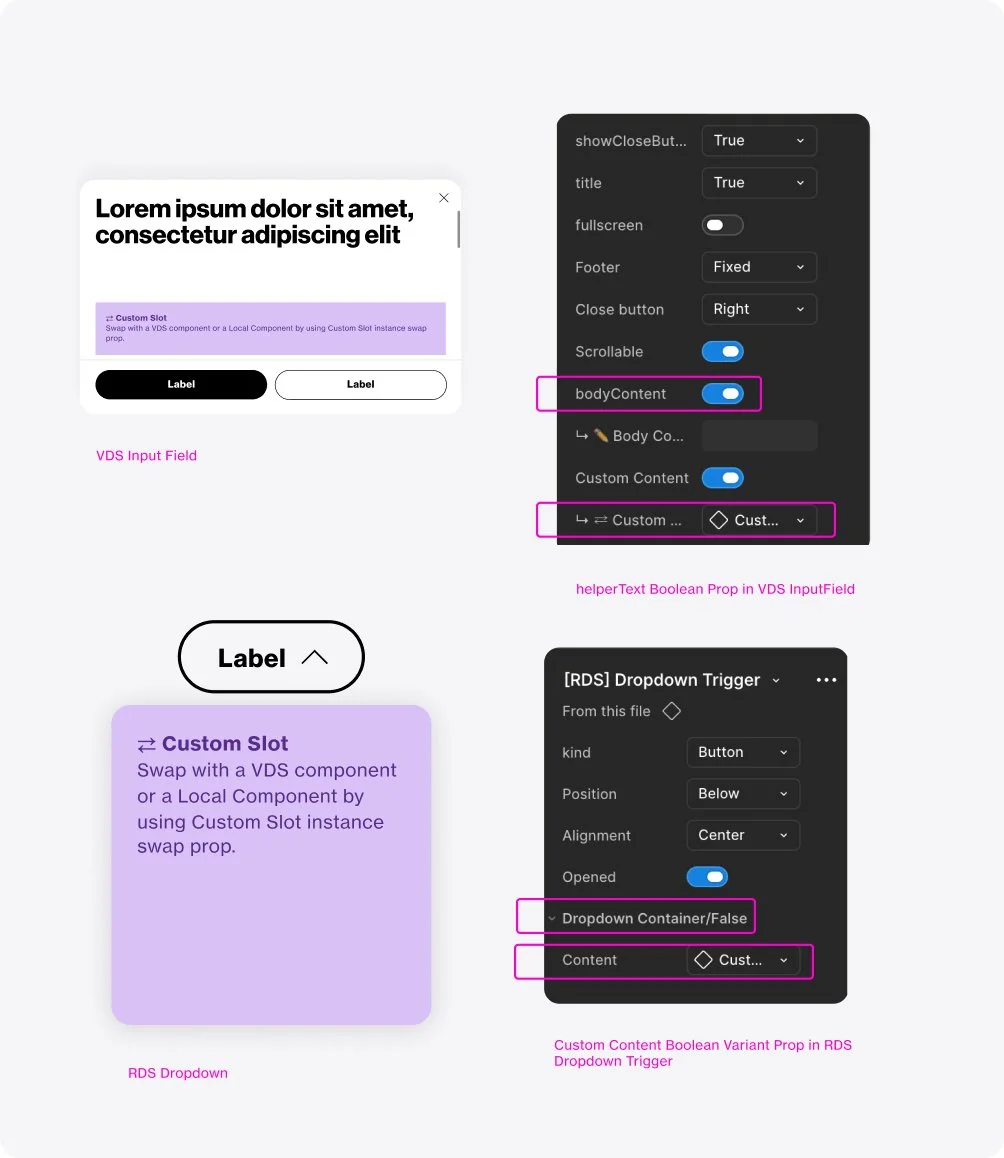
Use of Boolean Properties enhanced usability by exposing the toggle directly in the properties panel and dramatically reduces the number of required variants.
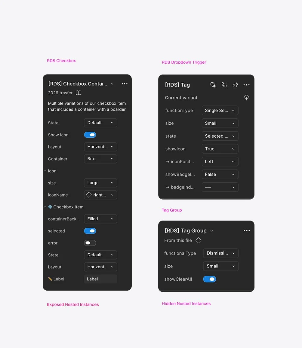
Components exposed relevant properties from nested instances allowing designers to configure the entire component from the parent's property panel in one go.
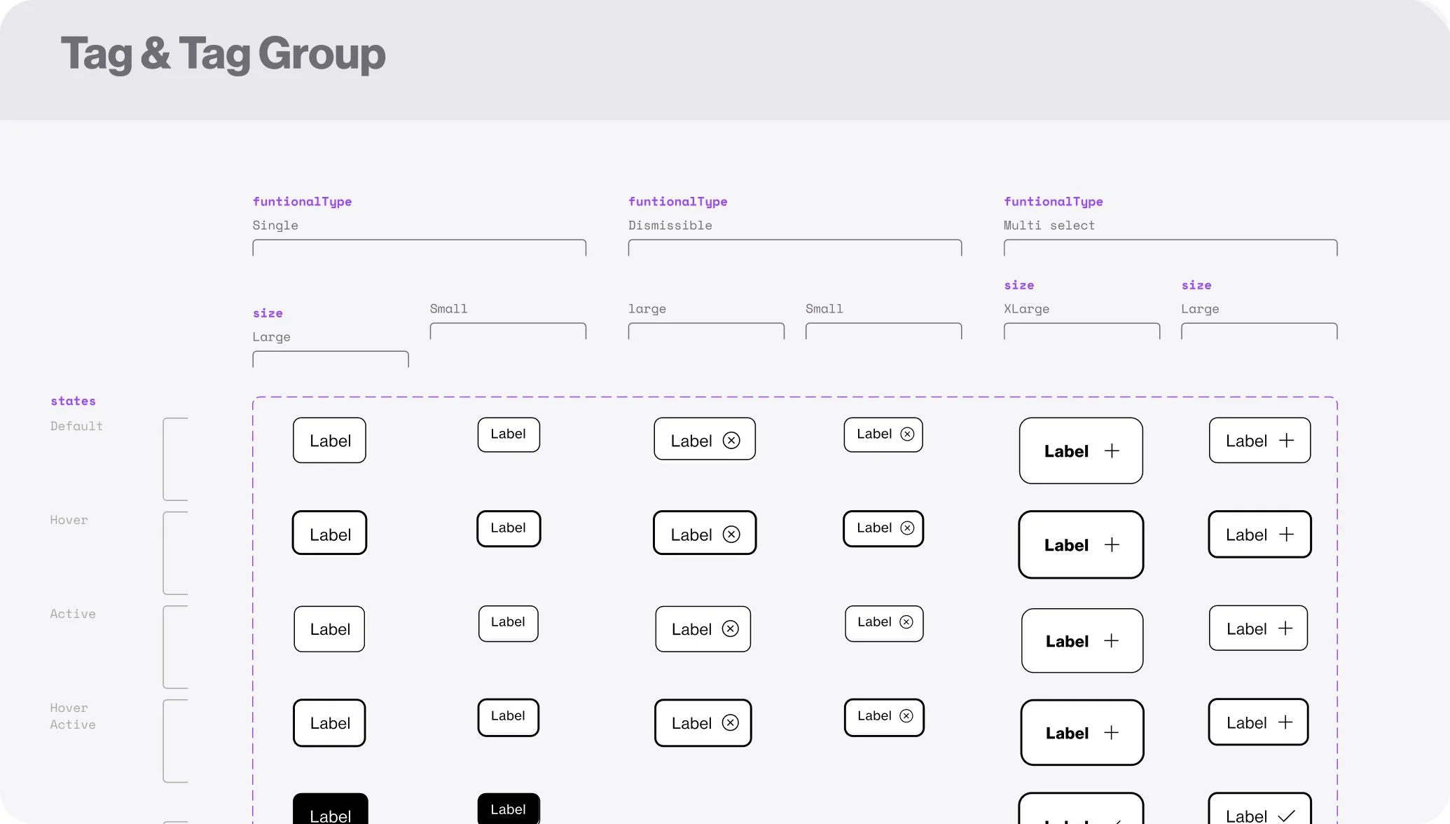
All construction decisions deferred to the spec, which ensured alignment between design and code, independent of any tool's specific features or limitations.
Operations & Stakeholder Alignment
Design Request Intake & Roadmap
I developed a quarterly roadmap which I presented to VDS leadership to secure engineering resources. The roadmap set out to build six components per quarter, working in two-week agile sprints in tandem with development. My team and I met with designers to review component requests, prioritizing the development roadmap through a production status vs. scale usage lens, prioritizing components that solve for high-usage needs currently in active development to prevent non-standard code from becoming global technical debt.
Use of Boolean Properties enhanced usability by exposing the toggle directly in the properties panel and dramatically reduces the number of required variants.
Components exposed relevant properties from nested instances allowing designers to configure the entire component from the parent's property panel in one go.